(Click here to jump to the recommended song, Lobo Jones by Jackie Gotroe!)
If you haven't already, please take my User Experience Survey. It's only ten questions, and it will help me improve things here on The Rebel Palate. Thank you.
Right there, Rebels!
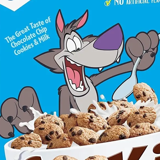
I noticed that REAL ART on Food Packaging had an error. For some reason the picture of a Cookie Crisp box was missing.
Finding a replacement obviously didn't take long, but I found something I didn't expect. You know what they say about happy accidents.
That they, uh... exist.
I'd criticized Chip the Wolf's design in the above post, essentially calling it uninspired and bland, but I had only seen the U.S. version.
While fixing the picture, I accidentally found three main international variants on the design. Cookie Crisp is actually made by Nestle outside the United States. Turns out they're partnered with General Mills in what they call "Cereal Partners Worldwide".
Nestle produces many of General Mills' brands outside the U.S., not just Cookie Crisp.
But you wanna see the international variants, don't you?

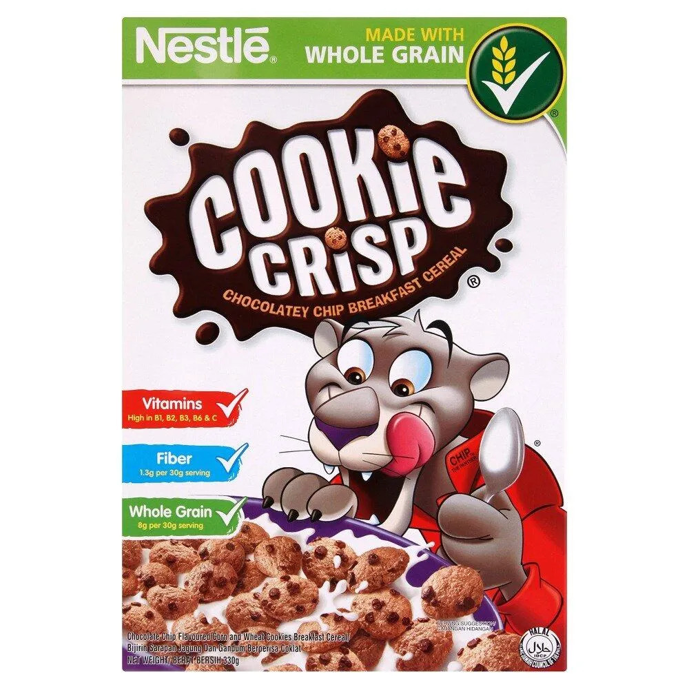
I don't usually like modern styles, but this one is a vast improvement over the American one. This style is, you know, stylized.
This version is more simplistic than the U.S. one, with even the line down the middle of the snout missing. The snout is a wedge with a purple balloon stuck to it. The eyes are comparatively small, the ears are triangles and the eyebrows are thick.
And the British version of Chip (or should he be called "Crisp"?) is expressing an emotion other than feigned enthusiasm. He's hungry. Though it looks like he's hungry for you rather than the cereal.
He also takes way less space on the box than the U.S. or even other countries'
versions. I think this is related to Nestle's "healthy eating" strategies.
Nestle has taken a lot of measures over the years to inform customers of
nutrition content and even make their cereals healthier.
In 2013, they implemented the UK's standard "traffic light" system. High levels of fat, saturated fat, sugar and sodium are red, low levels are green and medium levels are amber.

|
| An example of the Traffic Light system, from food.gov.uk |
Nestle also pledged to reduce their cereals' sugar content by 10% by the end of 2018. I think reducing mascots' prominence is part of this effort, and I think it's the same reason Chip is looking "forward" on this box.
On grocery store shelves, cereal mascots often look "down". Supposedly this is a psychological trick by Big Food to aggressively market sugary cereals to children.

|
|
Pictured: Big Food. |
The thought is that children are subconsciously tricked into trusting the mascots. There are studies about it linked in this journal.
I don't care that much about the subject because, oddly enough, I already did a lot of research about it in middle and high school.
I'm also not that afraid of it. Let parents be the parents, and let them teach their kids that Cap'n Crunch is not their friend.
Anyway, it's possible that the latest UK design is meant to combat this phenomenon.
Here's the design that shows up in other European countries, such as France
and Iceland (though it was used in the UK at one point):


I think the one on the left is more recent, being that it shows Chip less
prominently. Also, his eyes are technically "looking down" but it feels like
he's actually looking forward. The design on the right was definitely used in the UK, but I don't know about the one on the
left.
He has this red jacket with a popped collar, which I think is kinda cool.
Sure, it does look like Nestle are "trying hard to be hip", but it adds
youth, energy and personality to the design. Which is to say they're trying
hard to be hip.
It also reminds me of Von Doogan, which is from the UK. Huh.

|
|
Image Credit: EtheringtonBrothers, Deviantart |
Hey wait... Is there a pun to be had about a wolf wearing a
red jacket? Lupin III? Huh? Huh? No?
Even though this design isn't incredibly simplified, and in fact looks like a different-artist-redraw of the U.S. version, it looks friendlier. It looks like, I dunno. If I were tricked into trusting this guy, I wouldn't blame me.
The rounded shapes, especially in the snout, are obvious. It's shaped less like a half-oval and more like two ovals stacked on top of each other. It's actually a little closer to what I would draw.
I dunno, this style is just more appealing to me. There aren't many differences, I wonder what-
Wait.

|
|
The one image of Pepe Le Pew where his facial expression DOESN'T make me
uncomfortable. |
You see it, right? Sorta? The snout overlaps the mouth.
For some reason I've always thought this was really cute, so I use it for a lot of my own animal designs.
Also worth noting is the line at the edge of the mouth, which...

OKAY NEVERMIND I THINK I FIGURED IT OUT.
I found a seemingly American design of Chip with the red jacket, but I'm not sure what's up with this one.

There's something so off about Chip's eyes in this version. It's his top eyelids, or maybe his freaky nonexistent eyebrows. I also think it's weird that his bottom eyelids wouldn't be drawn, given he's meant to show excitement in these designs.
You know? I think that's the problem with the current US design. Here's a lower-eyelids edit I made of that:
I mean, he definitely looks crazier, but that's how smiling works. The
pupils would have to be slightly higher, though. I guess they don't use the
lower lids as part of the "looking down" thing?
Now, the 2017 redesign says General Mills, and the designers are from the United States, but I don't know if this design was ever sold in America.
I tried looking at General Mills' website through The Wayback Machine, but the
only Cookie Crisp graphics I could find for 2017 had a cross-promotion with
Star Wars: The Last Jedi.
I have two mutually exclusive guesses about the U.S. Red Jacket design: either it was used in the U.S. but no one saved any pictures of the box and General Mills didn't use the graphic on their website... or the design was never used in the U.S. for some reason.
I gravitate towards the latter, because I feel like there's no reason this was documented only by the designers, but I also can't see why it would go unused.
I kinda like it, kinda don't. If there were less shading, it would look kinda like a cartoon on Nickelodeon in the 90s or something. But I don't like the shading, and I don't like those eyelids. Or that there's no eyebrows.
Also of note is the Malaysian Cookie Crisp box. Instead of a wolf, it features a panther, still named Chip if you look at the jacket collar.
Maybe they don't "get" wolves in Malaysia? I think at worst people would have mistaken him for a dog, but whaddo I know.
Weirdly, I don't have much to say about this one. I appreciate that the color scheme is almost-similar, but they didn't exaggerate as many features, maybe to make it look as much like a panther as possible.
Whereas the wolf, at least in his current U.S. design, is a pinhead with a
giant snout and crammed-together eyes.

|
|
"Who you callin' Pinhead?" |
The panther has wider eye spacing, and more even-looking facial proportions. This doesn't look bad, per se, but it looks like they're going less for cartoony and more for... knock-off Disney.
Like the U.S. and Euro designs, Chip the Panther has a spiky tuft of hair on his head, to contribute to the youthful energy or maybe the fact that it's a cartoon. Or to make it vaguely human, which I think was the intention for Pepe Le Pew.
Once again, I really don't like the shading. What are cereal mascots made of, anyway? Fiberglass?
The design isn't exactly bad-looking, though. Kinda none of these are. They all involved some level of creativity, and they get the job done.
And at the end of the day, even though this was a short post... I CAN'T BELIEVE I HAD THIS MUCH TO SAY ABOUT THE DAMN COOKIE CRISP WOLF.
What's your favorite Cookie Crisp design? Let me know in the comment section nobody ever uses!
Today's recommended song is Lobo Jones by Jackie Gotroe. And why not Hungry Like the Wolf?
Because... everyone's heard that song? I bet you didn't even know Jackie Gotroe existed.
There's also a song called Hillbilly Wolf, which I think is a more obscure song but it was done by a less obscure artist, Link Wray.
Anyway.
Stay Sexy!
Comments
Post a Comment
Agree? Disagree? Let's hear it!