Howdy, rebels.
I've said it before: if you want to sell me something, put a wacky cartoon on the label.
Lately, though, I've figured out cartooniness isn't the whole picture. Not
every cartoon design works on me, especially ones like this:
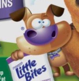
Sure, it's recognizable, especially with the big purple nose, but even Little Bites' blueberry muffins had that.
There are some parts I like about the Cookie Crisp wolf, like how the ears are drawn a little differently than other styles, or the cel shading (AKA no shading) on this recent version.
But it has no identity. If General Mills' character designer drew
something I've never seen before, I couldn't tell it was a General Mills
design without the General Mills logo. And they don't care.
I don't expect them to care. If they want to hire some fancy, avant-garde artist, they will. It's just another case of "why fix what ain't broke". What they've already got sells enough boxes.
But yes, it's not just cartoons. I've figured out the art I like- and the guys I'm attracted to, because I'm so not into the Hollywood types- have to be interesting. They must have some amount of identity. Even, maybe especially, if that means imperfection.
Before I list my favorite food art, here are the qualifiers:
1. It must be heavily stylized. Cartooniness may come with the territory, but it doesn't have to be a cartoon.
2. It must look like, at some point in the process, someone had to draw it
first.
3. Preferably, though optionally, there should be different art for each variation of the product.
And to give it a special Rebel Palate twist, I'll be drawing one of my characters in each of the art styles. I've been itching to show them for a while now.
Here's everyone in my "regular" art style. These characters come from
different "universes" I made up. Will they ever be "in" anything? I sure hope
so.
And I'll share some backstory on them.
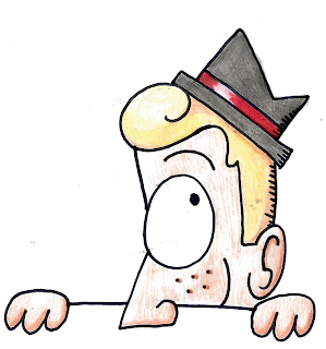
CHAD KILROY - A fifteen-year-old aspiring detective. He "canonically" wears a grey fedora with a red band, but I... kinda suck at fedoras. Also my scanner makes him even more pale than he's supposed to be, so sorry about that.RICK WEDNESDAY - Weird things happen every Wednesday in his city, where he's the non-powered superhero. The city government granted him a private investigator's license because there was no precedent for what he does. Also, he's an accountant and a prepper.
DUCKY-CHAN - Born from a scribble and my binge-watch of Duckman. Ducky-Chan is my way to make fun of anime without knowing how to draw anime. She can only say "QUAKKU-DESU!" really loud. Don't ask why she has human ears.
FOODMARK
First it's important to mention that products made by Royal Ice Cream in Connecticut have been recalled due to listeria contamination. This includes Biggy Iggy and Chewy Louie ice cream sandwiches with "CT 121" stamped on the outside in tiny, tiny letters.
Uh, guys? That's, um, that's... the ones I got back in September...
Visit this link to learn more about the recall. If you still find these brands on the shelves, probably talk to the store manager to make sure they know about the recall. They should already, but you can never be too careful sometimes.
Moving to the sunshine and rainbows part of things, I love this art
style.
Thing is, these are undoubtedly bad drawings.
The lines are shaky and look like they were done with Sharpie. There's no regard for 3D space. Anatomy is thrown out the window. The hands and feet are made of a bunch of little loops.
My brother calls Louie's feet "feather duster foots"- so badly drawn they're not worthy of proper pluralization. I can hardly tell if that's his heel or another toe I'm looking at.
But I love it. This style just doesn't give a crap. I wish I could be as carefree and wild, but I... am too much of a perfectionist.
I've said this before, but I think BI and CL reflect parts of hot rod culture, with Biggy Iggy as a greaser/biker and Chewy Louie as a cute-ifiied Rat Fink ripoff drawn from memory.

|
|
Original Images: Richmond Market |
I find it interesting that the drawings are colored differently. Biggy Iggy had to be colored electronically, or else the colors wouldn't be so solid, but Chewy Louie looks like watercolor or something.
I always wondered if CL's packaging was designed before they moved on to digital art, but the bubble text and blue background are just as solid as BI's entire artwork. Chewy Louie is actually the more recent product.
It makes me think they wanted to move towards traditional art after BI because it looked better, but they never put their own art on anything else as far as I know.
I'm just gonna go off-track for a second, because I think this is
interesting:
According to Trademarkia, Foodmark had a bunch of other trademarks at one point. Most of these died in 2007.
Wondering what the packaging on the "dead" products looked like, I put Foodmark's "proprietary products" page in the Wayback Machine. This was archived in 2008, which was as far back as it went:
I know what you're thinking: "Huh?"
Apparently Foodmark distributed Cabot Mac n' Cheese at some point. Which is
kinda neat, because it looks like they got first dibs on it. It's no longer
distributed by Foodmark, but it still exists. I even saw it in a little
country store when I went to Vermont.
I don't think Foodmark had a website before all those trademarks died. My theory is that those brands were the 80% of their work that gave them 20% of their money. Maybe things got tough, and Foodmark poured all their resources into more profitable products.
Or maybe it was just more difficult to maintain product lines they didn't
exactly own.
But I'm speculating. I just like company lore.
Anyway.
I've tried to draw Iggy in the past, but the style really cuts against my usual habits. My first instinct was to draw an oval, add guidelines and pay literally any attention to 3D space. Silly me.
For this style, I draw everything in pieces. You do the arm first, then this
line, then the eyes, then this line, et cetera. You have to when you use a
marker instead of a pencil.
DESERT PEPPER TRADING CO.
This was yet another thing I saw for the first time in Vermont, but it also exists in my home state.
The first time I saw this, I said... well, I don't remember what I said, but it was nothing negative.
I've still never had Desert Pepper salsa, but I can at least comment on the neat designs.
It's all done in a weird, adorable style that reminds me of hieroglyphics or cave paintings. It's so flat, with its consistently one-eyed profiles and lack of perspective, yet so lively. I especially love when they "start" the drawing on one side and "finish" it on the other.
I found pictures with better resolution and color, which I used to further analyze the art style. The coloring method surprised me.
This high-res version of 2 Olive Roasted Garlic shows a highly textured coloring style.
My closest guess is that it's dry-brushed acrylic paint.
Maybe the character is sketched, then the background is colored in, then the character is colored and the outline is applied last. It would be hard to do the outline first and then color it, assuming it really is paint.
I think the outline is also painted, considering the inconsistent width. In
that case, the brush must have a lot more paint or a small amount of water
added to be that smooth. The smoothness makes it look like marker, but... I'm
tired of drawing with marker, honestly.
Desert Pepper's three "classic" salsas have a moodier tone, with muted, monochromatic color schemes. Rather than blended colors or crosshatching, these pictures are shaded with thick lines. It reminds me of woodblock prints, which did the same out of necessity.
Left: a woodblock print by August Hermann Scherer, photo by Helen Bell on
Pinterest; right: a woodblock stamp sold by Crisis Medicine.
Whether Desert Pepper's artist actually did a woodblock print is beyond me, but it seems plausible. Especially since it's a time-consuming medium and there are only three salsas with this style.
I went with the more lively style, because it's my favorite. It makes
everything look spicy.
Here's Ducky Chan.
WILD MIKE'S ULTIMATE PIZZA

|
|
Look closely. |
I guess my marker lines are kinda thin, though. Oh well. Maybe the original
was a smaller drawing?
And I had no idea how to fit Rick's amazing sideburns, so sorry if you care.
(Note from 7/10/22: Of COURSE it's all electronic, Kat. Dummy.)
CONCLUSION
Sorry for the delay. It uh, turns out this was really hard to do?
This post really stressed me out in places. I whittled it down several times from six to five to four to finally three entries.
I'm just gonna file this one under "N" for "Never Do Again".
It would've been easier to draw all the brand characters in my own art style, but then it wouldn't be challenging enough. Studying other art styles is an important learning tool.
I'll also use this as my opportunity to say that I am the artist of this blog. Maybe that was obvious, but I feel like all the graphic design work I do goes unnoticed. Probably because YOU'RE ALL USING THE MOBILE VERSION WITHOUT THE PICTURE OF THE SEXY CAR IN THE BACKGROUND.
LOOK AT THE SEXY CAR CLIPART. LOOK AT IT. BASK IN ITS PURE MOTORIZED SENSUOUSNESS.
No, but seriously.
Can you yourself a favor? Do you think, right as you find out about each of
my posts, you can go on your Compaq Presario or Raspberry Pi or whatever and
look at the graphically superior version of this blog? Or set a reminder on
your experience-ruining device?
I feel like all the seasonal theme changes are in vain. Those take more work, because I can't find clipart of specific cars like the Rolls Royce Phantom (III? I think?) or the Lincoln Continental Mark II. For those I find actual pictures and turn them into silhouettes via image-editing shenanigans.
I'm just saying. It's not like I can hire somebody to do all the visual work
around here.
Today's recommended song is Stray Cat strut by The Stray Cats, because...
because I referenced it earlier.
Stay sexy! (And for desktop readers, really sexy!)


Comments
Post a Comment
Agree? Disagree? Let's hear it!